
Diagrams take longer than renders. A render is one image; a presentation board also needs an exploded axonometric, a section, an elevation, and every one of them has its own drawing conventions. That is exactly the part an image model is good at, and also where it can quietly mislead you.
So instead of describing what AI diagrams can do, we ran four diagram presets on the same house and looked hard at the results. Every image below was generated once and not retouched (only resized for the web). The point is not that the results look good, most of them do. The point is to learn which parts you can trust and which parts you have to check.
The test: one house, four diagrams
The input is a small two-storey house with a timber-clad upper volume, a concrete ground floor with full-height glazing, and a pool. It is a real output from our Blender add-on test: a simple block model rendered in about a minute.
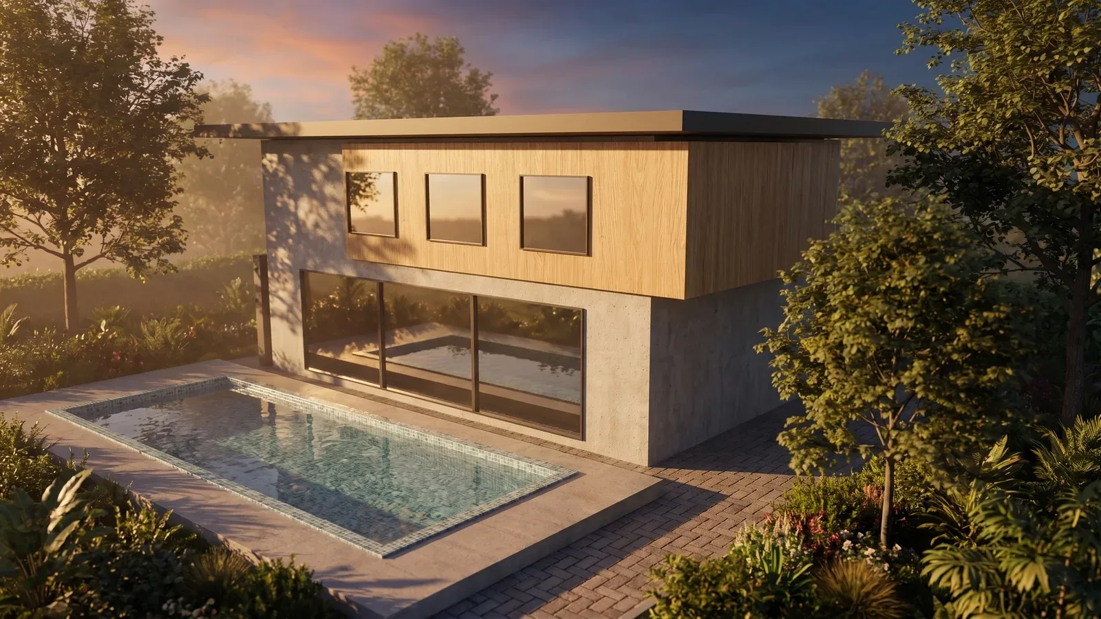
Remember three things about this house, because they are how we check the diagrams: the upper floor has three windows, the ground floor has three glass panels, and the roof is a flat slab with an overhang. Anything else a diagram shows about its structure or interior, the model had to guess.
Each diagram below uses the matching Syntina preset with its default settings, the same as clicking it in the app.
1. Exploded axonometric from a single render
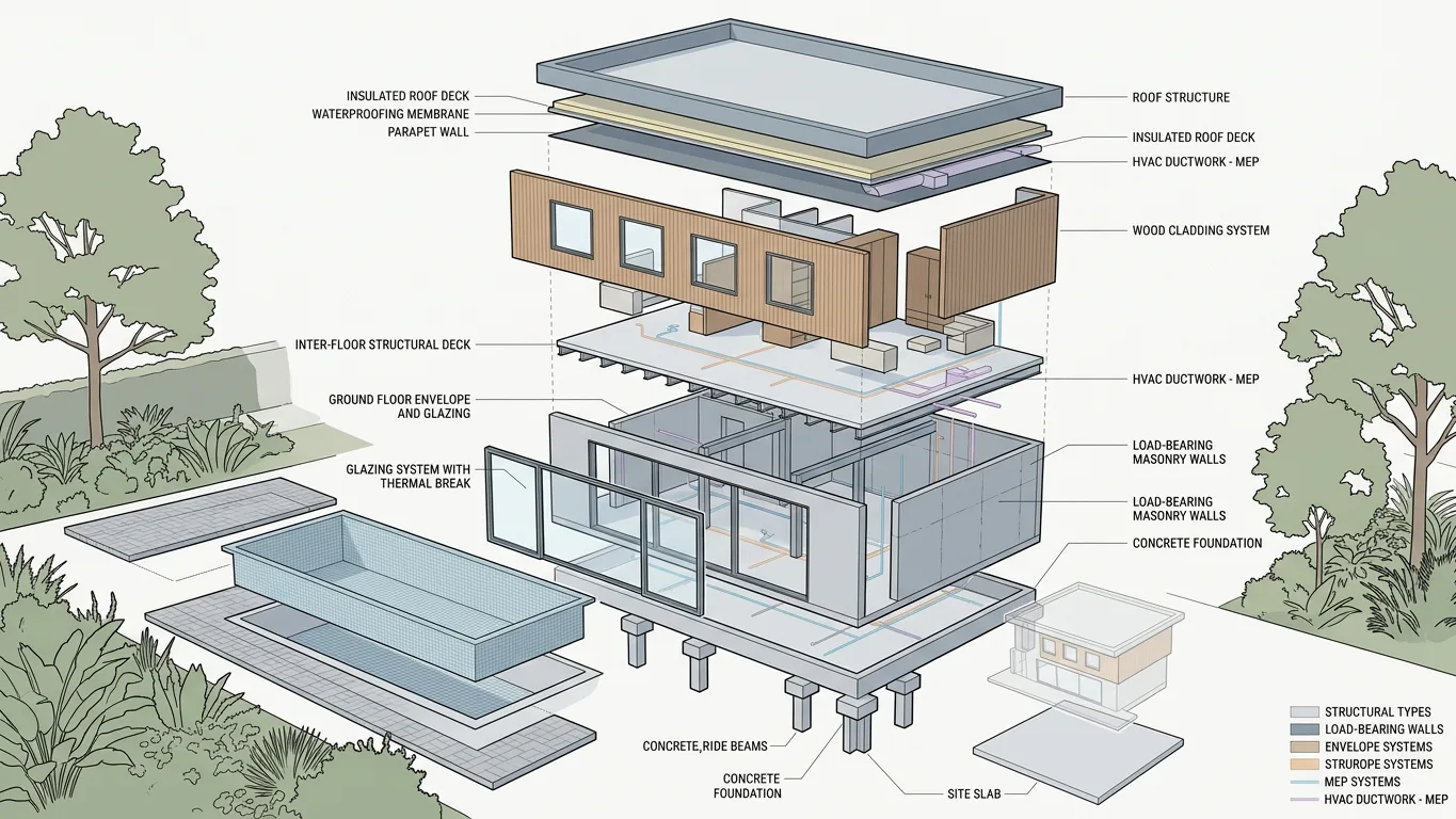
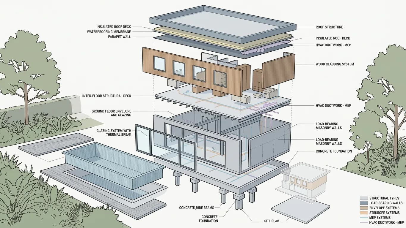
What it did well. This is the diagram students spend the longest on, and the model got the hard conventions right: a true axonometric view with no perspective, layers separated vertically with even spacing, dashed alignment lines between them, soft shadows under each layer, consistent line weights and restrained colour coding with a legend. As a first draft for a concept board, it is usable.
What it invented. Almost everything below the surface:
- The structure. Concrete piers under the slab, "load-bearing masonry walls" and a structural deck. None of that is visible in a render. The model picked a plausible construction system.
- Services and interior. HVAC ductwork, pipe runs and furniture. Plausible, and entirely made up.
- A fourth window. The upper floor has three windows. The exploded cladding panel has four.
- The labels. "INSULATED ROOF DECK", "LOAD-BEARING MASONRY WALLS" and "CONCRETE FOUNDATION" each appear twice. The legend says "STRUROPE SYSTEMS" and one callout reads "CONCRETE, RIDE BEAMS". Image models still produce text as pictures of letters, so typos are normal.
The lesson: the model can only see the outside of your building. Every construction layer in an exploded diagram made from a render is a guess. That is fine for explaining a concept, and wrong the moment someone reads it as your actual build-up. If the layers matter, tell the model what they are (a short brief with your real build-up, or a section of your own as input), then count openings against your model and re-letter the labels yourself.
If you want the step-by-step version of this diagram type, including how to draw one by hand, see the exploded axonometric preset page.
2. 3D cutaway (axonometric cross-section)
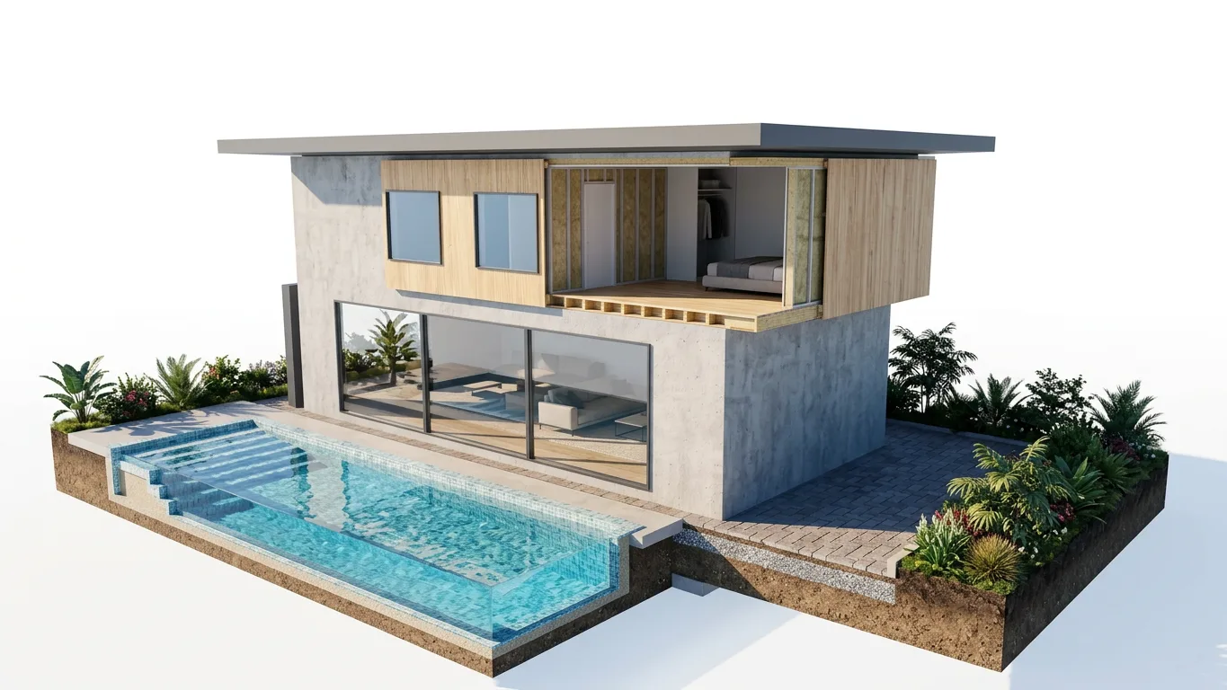
What it did well. This is the most "presentation-ready" image of the four. The model cut the site as a block, showed the pool's depth and the soil layers, opened the upper floor to show insulation in the wall, and kept the materials of the original render.
What it decided for you. Two things:
- Where to cut. It opened one corner of the upper floor and furnished it as a bedroom with a wardrobe. In a real section, the cut line is a design decision: you cut through the stair, the double-height space or the junction you want to explain. Here the model chose the cut.
- The projection. The preset asks for an orthographic axonometric, and the result still reads as a slightly perspective view. For a board that mixes it with true orthographic drawings, that difference shows.
The lesson: a cutaway is a great way to show atmosphere and materials in depth. When the position of the cut carries meaning, don't leave it to the model. Cut your own model at the right place and use AI to render that cut.
3. Elevation from a perspective render
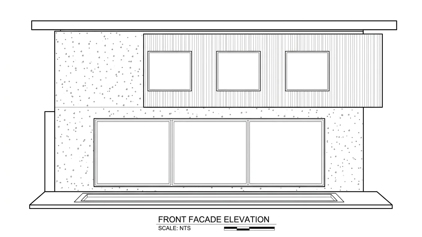
What it did well. This is the strongest result of the test. The model turned a three-quarter perspective into a clean orthographic front elevation, and the facts we can check are right: three upper windows, three glass panels, the timber volume cantilevering past the concrete base, and the roof overhang. Material conventions are sensible too: vertical lines for timber cladding, stipple for concrete.
What to watch. The title block says "Scale: NTS" (not to scale), which is honest, and then it adds a scale bar anyway. A scale bar on a drawing that isn't to scale is meaningless. More importantly, the proportions are the model's reading of a perspective photo. They look right, but nothing here was measured.
The lesson: elevations from renders are excellent for presentation boards, heritage and restoration sketches, and early design talks. Never measure from them. For documentation, trace over a scaled version in CAD, or export the elevation from your model.
4. Section cleanup: from a rough sketch to a competition-style section
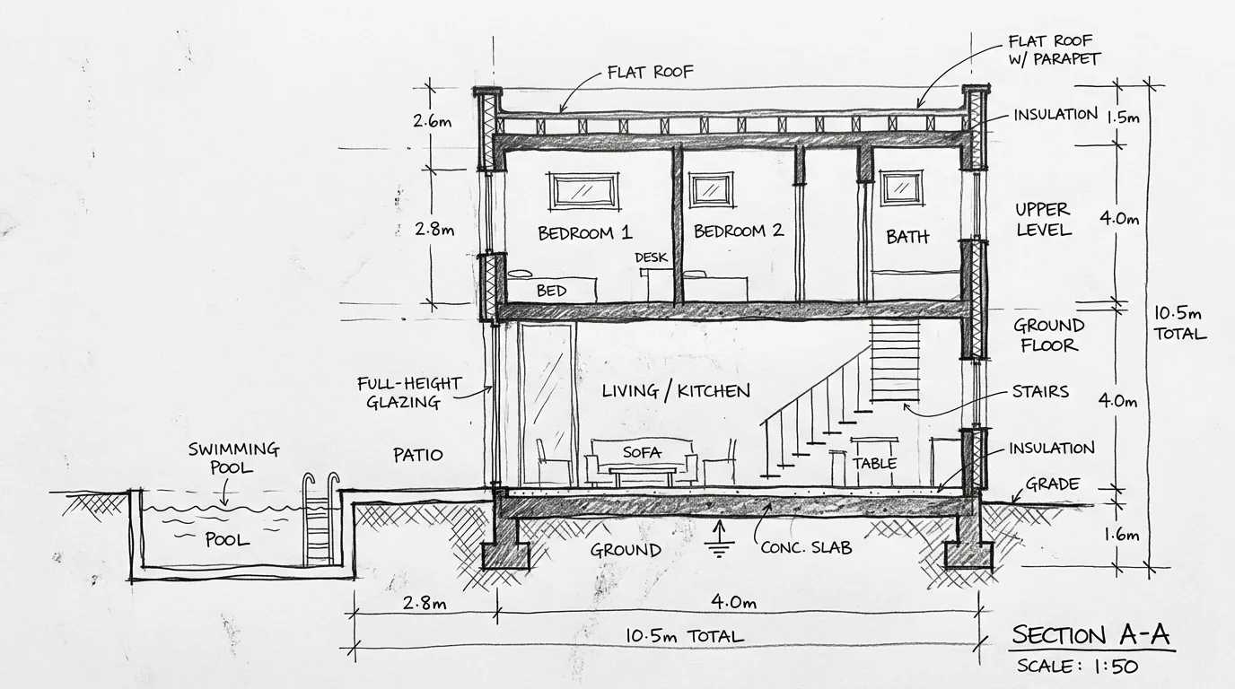
The section preset works differently: it doesn't invent a section from a render, it refines a section you drew. We had no hand section of this house, so we generated a loose pencil section first and used it as the input. This input is AI-generated and labelled as such.
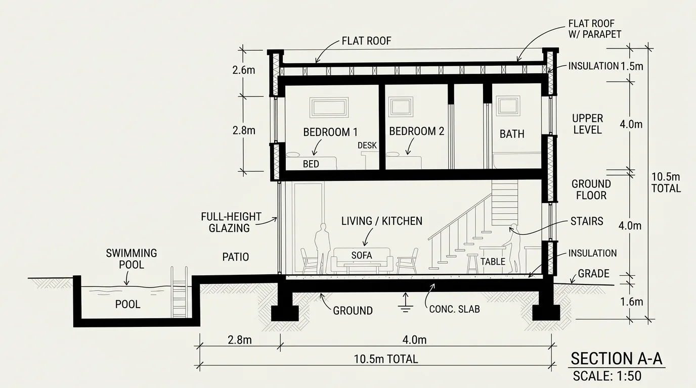
What it did well. Exactly what the preset promises: a uniform black poche on every cut wall, slab and footing, a clear line weight hierarchy (heavy cut lines, lighter elements beyond), human figures for scale, and all the original labels kept in place. This is the tedious part of a competition section, done in one pass.
What it did not do. It did not check a single number. The input's dimensions don't add up: the vertical parts (1.5 m + 4.0 m + 4.0 m + 1.6 m) come to 11.1 m, but the drawing says "10.5 m total", and the horizontal "10.5 m total" spans two segments marked 2.8 m and 4.0 m. The refined section copies every one of those figures faithfully.
The lesson: AI cleans up the graphics of your section; the content stays yours. If your sketch is wrong, you get a beautiful wrong section. Check dimensions and levels before and after.
What AI diagrams are good for, in one table
| Diagram | Input it needs | What AI does well | What it invents or ignores | Safe use |
|---|---|---|---|---|
| Exploded axonometric | One render or photo | Separation, alignment, line weights, legend | Structure, services, interior, extra openings, typos in labels | Concept boards; re-letter labels, count openings |
| 3D cutaway | One render or photo | Atmosphere, materials in depth, site cut | Where to cut, the rooms it reveals | Presentation images; cut your own model when the cut matters |
| Elevation | One render or photo | True orthographic view, opening counts, material hatches | Exact proportions; adds a meaningless scale bar | Boards and early talks; never measure from it |
| Section cleanup | Your own section drawing | Poche, line hierarchy, scale figures | It doesn't check dimensions or levels | Competition-style sections from your checked sketch |
A checklist before a diagram goes on your board
- Decide what the diagram has to explain. Build-up, circulation, massing, material? That tells you which type to make and what input to give.
- Give the most constrained input you have. A clean orthographic screenshot beats a moody perspective. Your own section beats asking the model to imagine one.
- Generate, then compare against your model. Count windows, doors, panels and floors. Check that levels line up.
- Re-letter every label in your layout tool. Treat model-drawn text as a placeholder.
- Check every number. The model copies dimensions, it doesn't verify them.
- Say what it is. If a diagram is illustrative, mark it "not to scale" and don't add a scale bar.
FAQ
Can AI make an exploded axonometric from a photo or render? Yes, and the result follows the drawing conventions well. But the layers it shows are guesses about your construction. Use it for concept communication, or give it your real build-up and check the result.
Can AI replace sections and elevations drawn in CAD? Not for documentation. In our test, the elevation's opening counts were right but nothing was measured, and the section preset kept wrong dimensions without complaint. Use AI for presentation versions, and keep the measured drawings in your CAD or BIM model.
Which input gives the best diagrams? The one that leaves the fewest decisions to the model: a clean, evenly lit view of the massing for exploded and elevation drawings, and your own section sketch for section cleanup.
Is this useful for architecture students? Very, especially for iteration: you can try an exploded diagram of each design option in minutes. Just be ready to explain every layer in a crit, because a reviewer will ask what the model made up. There is more on student workflows on the architecture students page.
Try it on your own building
The exploded axonometric preset works from a single render or photo. Try it on your own image with the free credits you get at sign-up, then run the checklist above before it goes anywhere near a board.